Let's Talk
Need advice on furnishing your space?
Tell us the sector, the space and the quantity, and we'll put together a tailored recommendation — no obligation.

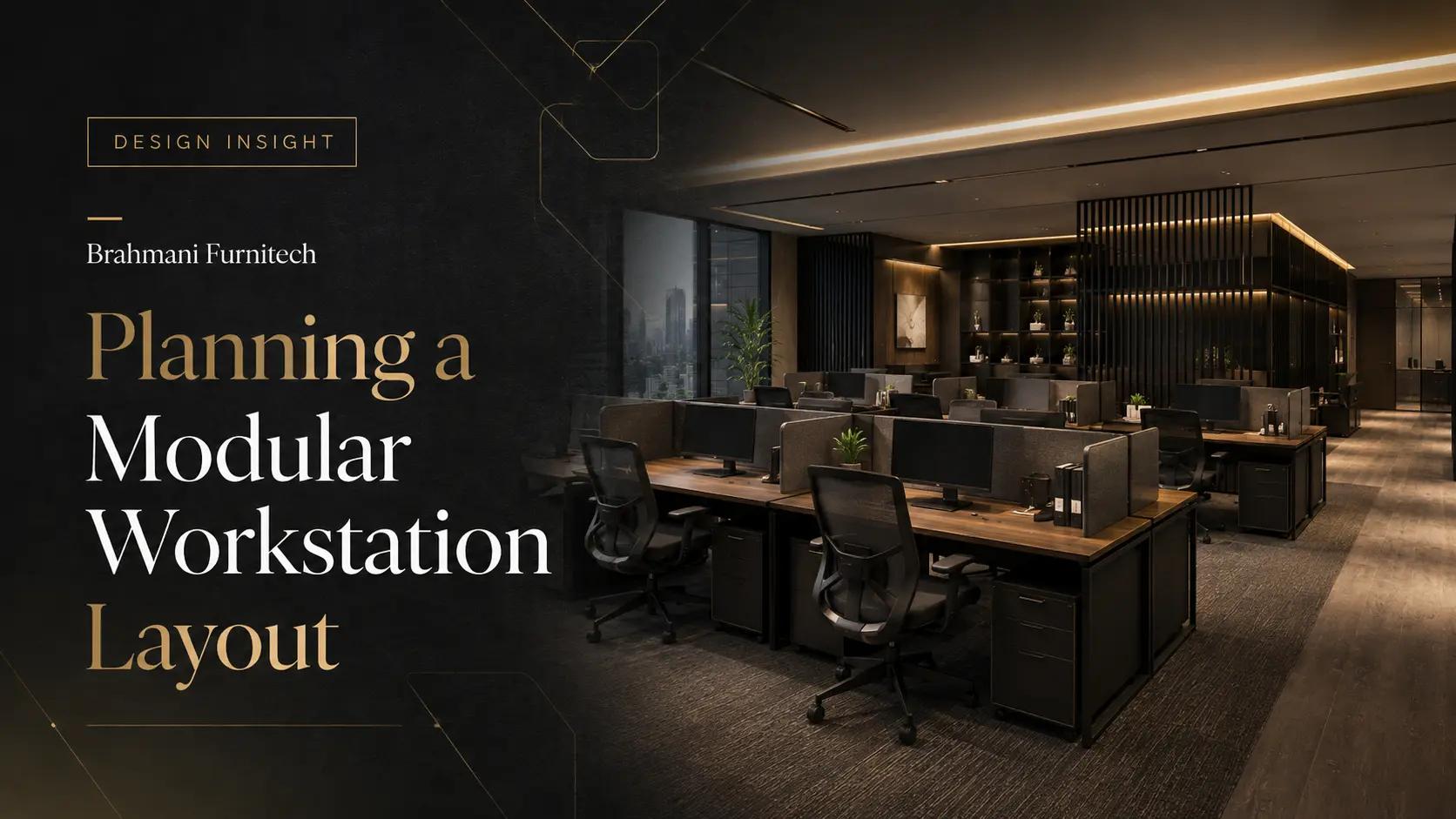
Modular workstation systems are flexible enough to produce almost any arrangement, which is exactly why they are easy to get wrong. The system will happily let you build a layout that is technically efficient and unpleasant to work in.
A few principles make the difference.
The most common planning error is to place workstations first and treat the remaining space as circulation. It should be the reverse: establish the movement routes, then fit the clusters between them.
Think in a hierarchy. Primary routes carry people across the whole floor and should be generous, straight and obvious — these are the paths to the lift, the exit and the shared facilities. Secondary routes serve a neighbourhood of desks. Tertiary access is the last step between a secondary route and an individual chair.
When circulation is planned first, the floor reads as ordered. When it is left over, you get pinch points at the exact places people pass most often, and the space feels crowded even at modest density.
Leave enough width behind a seated person for someone to pass without them having to pull in. If that clearance is missing, that route will be uncomfortable every single day.
Very long unbroken runs of desks are efficient on paper and institutional in practice. Very small islands waste the shared-edge economy that makes modular systems worthwhile.
Clusters of four to eight positions tend to work well. They are small enough to feel like a team and large enough to share spines, screens and cable capacity. They also break the floor into legible neighbourhoods, which helps orientation.
Where teams differ in size, vary the cluster rather than forcing every team into the same module. A modular system's real advantage is that a six and a four can sit side by side without looking accidental.
Two considerations dominate.
The first is glare. Screens facing a window wash out; people sitting with a window directly behind them are backlit on calls. Running desks perpendicular to the window line usually resolves both, and lets daylight reach further into the floor.
The second is exposure. Nobody enjoys sitting with their back to a main circulation route and their screen visible to everyone passing. Where that is unavoidable, a low screen at the back of the run is usually enough to restore a sense of enclosure.
Desk-mounted screens are the main tool for tuning privacy, and small height changes have large effects.
A low screen gives a visual break and contains desk clutter while keeping the floor open and everyone visible when seated upright. A mid-height screen blocks sightlines between people sitting opposite each other. A high screen encloses the workstation and starts to affect acoustics, at the cost of making the floor feel cellular and reducing daylight penetration.
Mixing heights deliberately — higher on the exposed edge of a cluster, lower between colleagues who work together — usually beats applying one height everywhere.
In a modular layout, power and data reach the desk through the furniture, and the route has to be designed rather than assumed.
Establish where the floor or wall supply enters each cluster, how it rises into the spine, and how it reaches each position. Then check the capacity: count the actual devices per person, including monitors, laptops, chargers and any desk equipment, and make sure the specified outlets cover it with headroom.
Cable management that is hard to open will not be maintained, and within a year the tidy spine is a tangle. Choose covers that a person can open one-handed.
The point of a modular system is reconfiguration, so the layout should not depend on being exactly as drawn.
Keep a consistent structural grid so a cluster can grow or shrink without moving everything around it. Avoid bespoke one-off components where a standard one will do — they become the reason a future change is impossible. And leave a small amount of genuinely unallocated space; a floor planned to one hundred percent occupancy has nowhere to absorb a new hire except by re-planning.
Before committing, walk the plan mentally from the lift to the furthest desk. Count the turns. Note where two routes cross. Look for places where someone would have to squeeze past a seated colleague, or where a chair pushed back blocks a main route.
Most layout problems are obvious on that walk and invisible in a plan view.
A layout drawing shows footprints. It does not show sightlines, glare, noise or the feeling of sitting in a particular seat. Where a floor is large or a decision is expensive, mocking up a single cluster on site and letting people sit in it for a few days will tell you things no drawing can.
If you are planning an open-plan floor and want to talk through cluster sizes or circulation, we are happy to help.
Written by Brahmani Furnitech ·
Tell us the sector, the space and the quantity, and we'll put together a tailored recommendation — no obligation.